For goldbugs, silverbugs, oilbugs, and commoditybugs ... last night wasn't all that great! All of our top assets got beaten up.
Charts show that we are near a major decision point, where the prices may correct all the way back to their long term trendlines - and if they break below trendline support, the multiyear bull markets may be over. However, those trendlines have held reliably for a few years now, and we can be cautiously optimistic that they will continue to hold - in which case we will have the opportunity to build our positions even further at favorable valuations. Better to buy at the bottom side of a channel when there's plenty of upside, rather than chase the market at the top side of the channel when there is limited room to rise further!
Someday, we are bound to get hit with a serious cyclical downturn in the commodities, probably triggered by a global economic slowdown led by the US and/or China... but it doesn't look like it's going to happen for this particular dip. US housing is getting crushed (especially for new homes) but employment and the business sector are hanging on, and it could be quite possible that the cyclical rebound in the business sector will soften the pain of a housing slowdown.
Gold could dip to the green trendline (a tad below 600),
but unlikely to break below that and go all the way to the white trendline (knock on wood!)
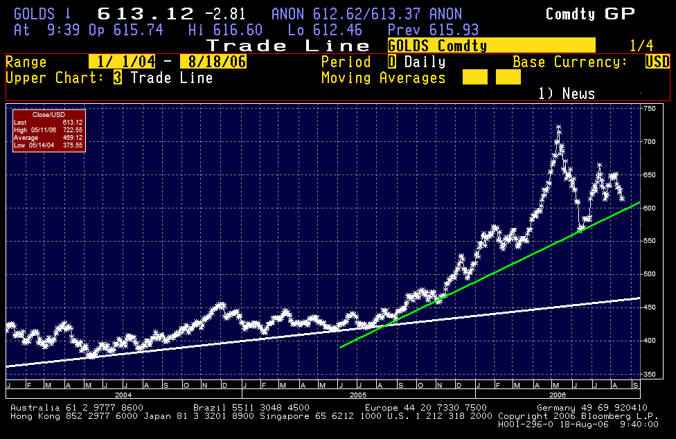
but the red line seems unlikely
Crude Oil will probably fall further until it hits channel support (at around 65)...
and check out how reliable this channel is!
and check out how reliable this channel is!

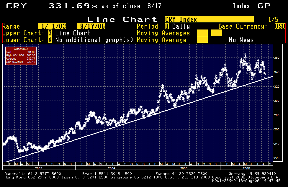
CRB Index ... ditto!
I used to be a big fan of technical analysis like momentum indicators and such, but now I'm most fond of Jim Sinclair's favorite tool, the straightedge. Whip out your straightedge and a chart of your pet asset, and start looking for trends (tops or bottoms that fall on a straight line) or channels (parallel directional trendlines). You might be surprised at what you see emerging out of the noise ... trends and channels that have been reliable for months or even years... to give you *extremely* solid indicators of price ranges in trend cycles. Forget about triangles, wedges, head & shoulders or other patterns that usually require pharmaceutical assistance to identify!
In application, it's safest to go with the main underlying direction of the trend. In a bull market, go long when prices have fallen to downside channel support. In a bear market, go short when prices have rebounded to upside channel resistance.
On the other hand, countertrend trades are always questionable! Says the guy who sold some gold at channel resistance at $485 only to see it make a HUUUGE breakout to $650! (smacks forehead again) But think of it this way, if it makes a breakout in line with the underlying direction, you're probably looking at a bigtime move underway with serious profit opportunity. Fortune favors the bold!
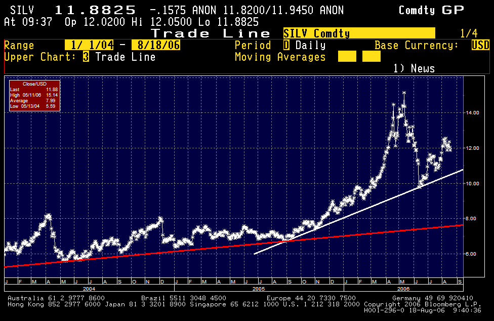
As a side comment, it's also useful to look for sympathy in asset price movements. If gold has fallen all the way to channel support, but silver/oil haven't.. then it's quite possible that things won't rebound until silver/oil have also corrected back to channel support levels. Similarly, when everything has fallen all the way back to channel support, then the market is probably ripe for a broad based reversal and rebound.
All hail Jim Sinclair! I think he's absolutely right... all you need is a ruler and a pencil and you're in business. Simple, inexpensive, and amazingly reliable!
In application, it's safest to go with the main underlying direction of the trend. In a bull market, go long when prices have fallen to downside channel support. In a bear market, go short when prices have rebounded to upside channel resistance.
On the other hand, countertrend trades are always questionable! Says the guy who sold some gold at channel resistance at $485 only to see it make a HUUUGE breakout to $650! (smacks forehead again) But think of it this way, if it makes a breakout in line with the underlying direction, you're probably looking at a bigtime move underway with serious profit opportunity. Fortune favors the bold!
As a side comment, it's also useful to look for sympathy in asset price movements. If gold has fallen all the way to channel support, but silver/oil haven't.. then it's quite possible that things won't rebound until silver/oil have also corrected back to channel support levels. Similarly, when everything has fallen all the way back to channel support, then the market is probably ripe for a broad based reversal and rebound.
All hail Jim Sinclair! I think he's absolutely right... all you need is a ruler and a pencil and you're in business. Simple, inexpensive, and amazingly reliable!